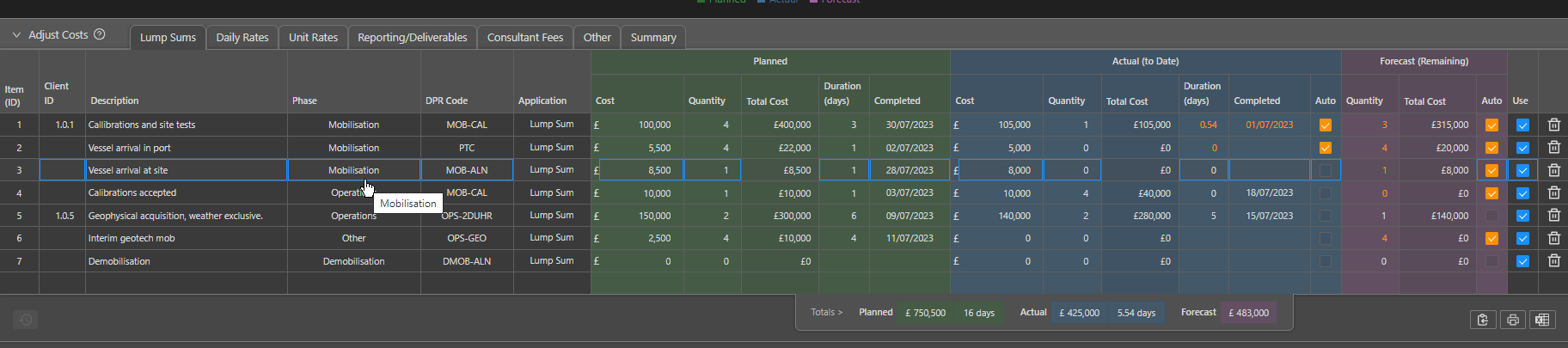
Activity Cost Tracking Dashboard
Costs Dashboard
The Cost dashboard allows for a visual representation of the variety of costs and budgets across an activity or within a specific time frame.
The data for an activity is fed into the Costs module by the Project Managers or other users and will be specific to a vessel. When filled in consistently the budget and running costs can be tracked in real time through the DPR codes added within the Data Entry module by Offshore representatives.
The dashboard can be accessed by clicking the Expand button at the bottom centre of the screen and selecting the tablet.

Once an Activity and Vessel have been selected using the drop down selectors in the upper-left corner, the initial figure shown in the dashboard is the line chart showing By Date costs along the project timescale. The chart will default to represent the entire time frame of the activity, with the end date set to the current date. This can however be altered to a specific date length using the dropdown calenders or entered manually into the text box located at the top of the dashboard page.
Following the setup of the the cost module, the chart is separated by category: Lump sum, Daily Rates, Workscope, Deliverables, Fees, Other and Total.

The chart also allows for the split between Planned, Actual and Forecasted data. The Actual data, which can be collated from DPR's and data entry, is represented as a solid line and stops at either the end of the date range or today's date if the project is active.
A thick dashed line will continue from the Actual line, representing the Forecasted data for the remaining time left in the project.
The Planned data which is inputted initially by the project manager is represented by a thin dashed line, coloured to align with the previously mentioned categories.
A text window with statistics will show Actual and Total when hovering over a specific date. The Chart can be customized to only show specific categories by unselect the layers (will then be grey in the legend). The same can be done to show the Planned, Active and Forecasted data separately.
The settings cog in the top-right hand corner also allows for you to edit the chart. The automatic end date can alternatively be set to either the activity end date, todays date or a preselected date. The planned costs will automatically show as horizontal lines, however they can be changed here to increase overtime. The Unit rates are set to begin on the activity start date but can be set to used the hours that are booked within the DPRs and should have ben inputted in the data entry section.
The Chart window can be changed to show a Summary of the Cost data using the drop down selector at the top of the window.
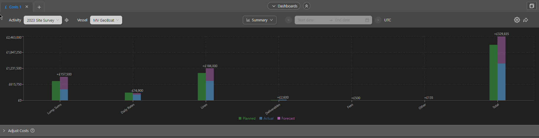
This represents the same data through a bar chart with the categories along the X axis and is separated by colour for the Planned, Actual and Forecasted data.
Both Figures can be exported in multiple formats using the arrow icon in the upper-right hand corner of the dashboard.
Costs can be edited under the Adjust costs tab. This brings up a table identical to those from the Cost module, sectioned with: Lump Sum, Daily Rates, Unit Rates, Reporting/Documenting, Consulting Fees, Other, Summary.