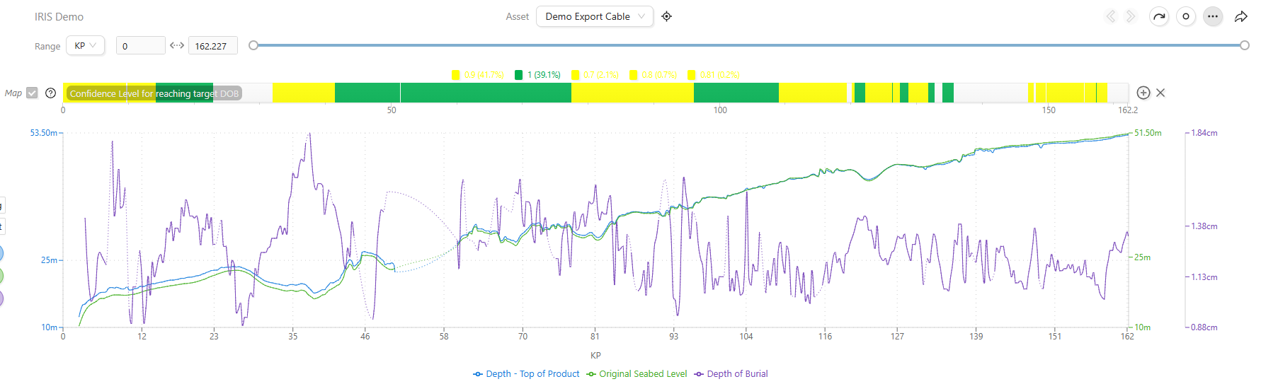
IRIS KP and time Based Asset Data Dashboard
Asset Data Dashboard
Everything in IRIS is linked to an Asset. This could be any combination of cables, pipelines or sites whether planned or installed. The Asset Data Dashboard provides a way of visualising data related to assets on a time or KP basis in graphs and charts.
Typically live raw data is fed directly into IRIS from an onboard vessel system or our proprietary V-Node system, for associated vehicles such as subsea trenchers or ROVs.
By having the raw data supplied live, issues experienced during operations can be monitored effectively and future faults can be traced back. IRIS can also consume data manually or post data-cleanse as required.
The dashboard can be accessed by clicking the Dashboard button at the bottom centre of the screen and selecting the tablet.
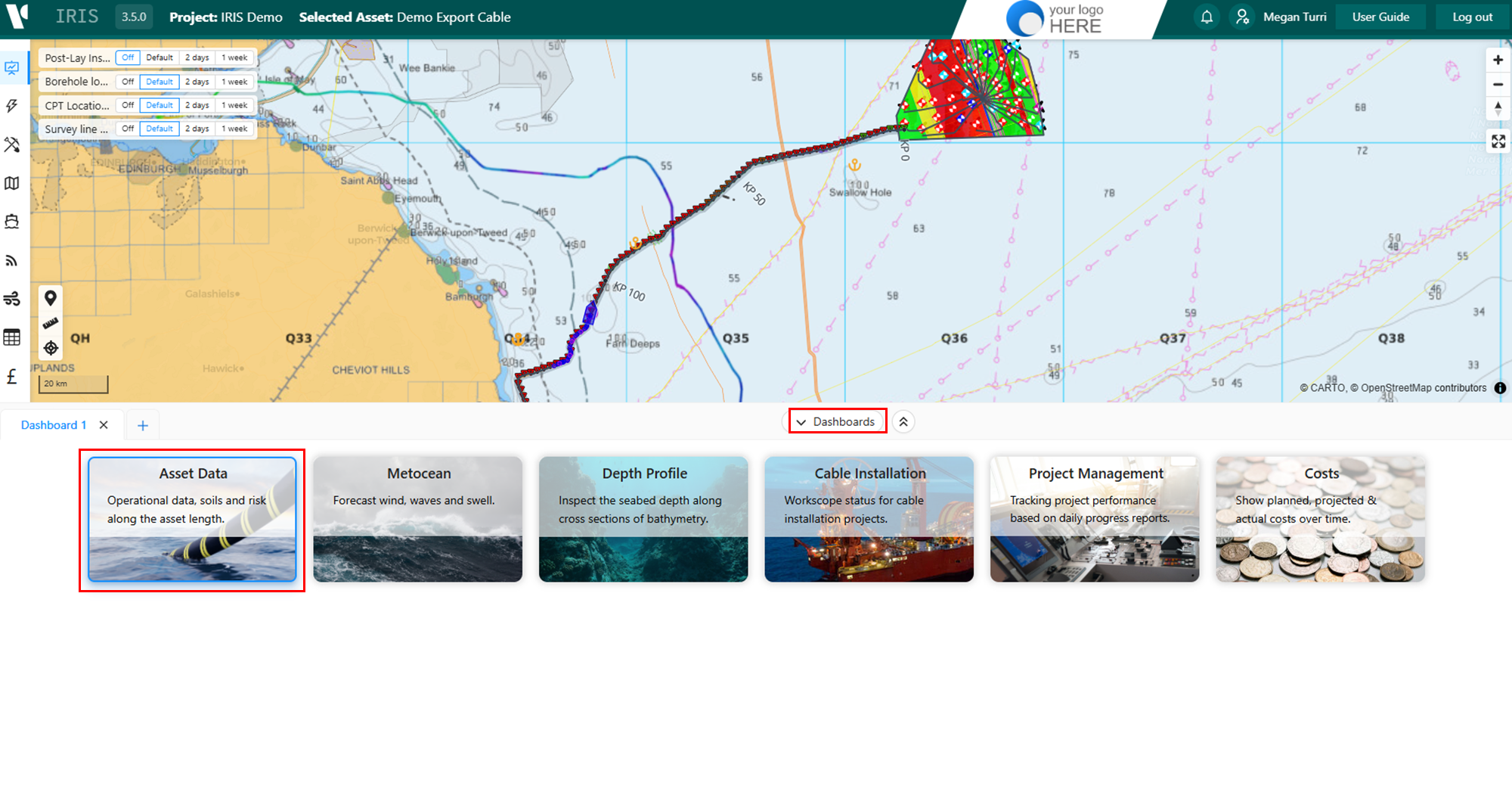
Adding Graph Data
To add data select the Asset in the drop-down at the top of the dashboard or through the Assets Module. Then select the range type from KP, Time (UTC) or Live.
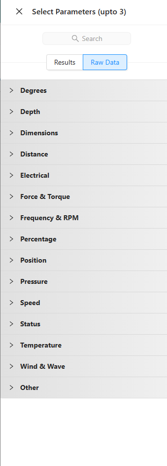
Selecting the 'Add Parameters to how Asset Data' will open a panel to the right, where data is listed you can step through the options including results or raw data to find the relevant parameters before clicking Add.

First select the Results (Processed and cleaned data e.g. Burial data) or Raw Data (Raw data feeds directly from subsea vehicles)tabs. You can drill down into parameters to specify which activity or vehicle the data comes from. Up to three parameters can be added before clicking Save to return to the dashboard.
Once loaded, each parameter is represented by a different colour in the graph and a tile beneath showing key statistics. A parameter can be quickly toggled on and off by clicking the coloured name under the graph. On each dataset, thresholds can be set to display percentages above and below the set value in the pie chart, with this also shown as a dashed line on the graph.
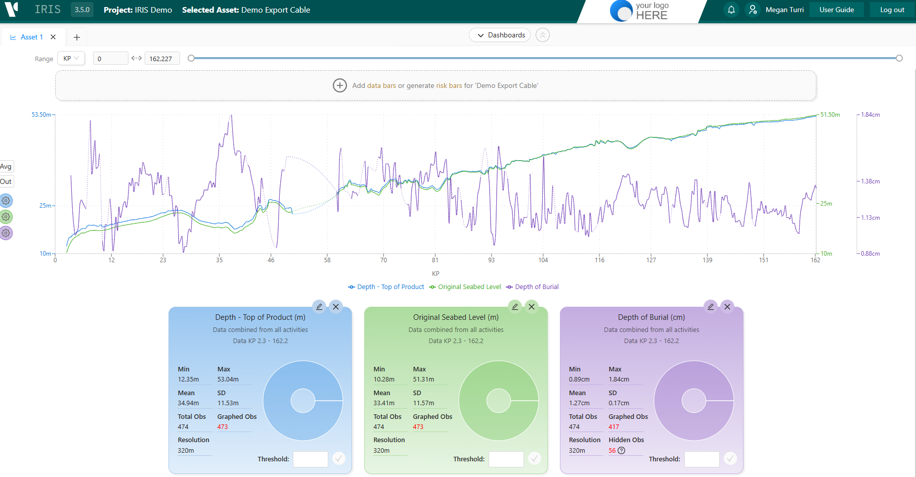
Graph Controls
To the left of the line graph there are a few way to modify how the data is displayed.
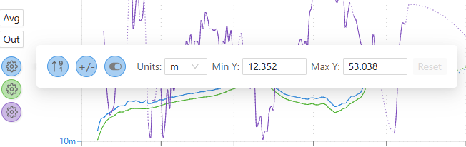
The coloured cogs allow you to flip the Y axis, align the units if more than one parameter matches and change the unit i.e. from metres to feet.
Above these you have Plot Type where you can choose from min, average and max
The Out button beneath allows you to remove noise in the data by removing outliers using different standard deviations.
Further controls can be found above the graph. From the left, there is a KP range selector and bar when the range type is KP and date-time selectors for when the range is time based.
The controls on the right allow you to nudge the KP left or right, reverse the X axis, show/hide data points and join/un-join gaps in the data. 
Data Bars
For linear assets like cables or pipelines you can add a data bar to the top of the graph and equally display the colour coding along the asset on the map. These data bars can be generated from data in Burial Assessment Studies (BAS), Survey Data such as pipeline/cable status e.g. Exposures and spans or from user generated risk bars in the Risk Manager.
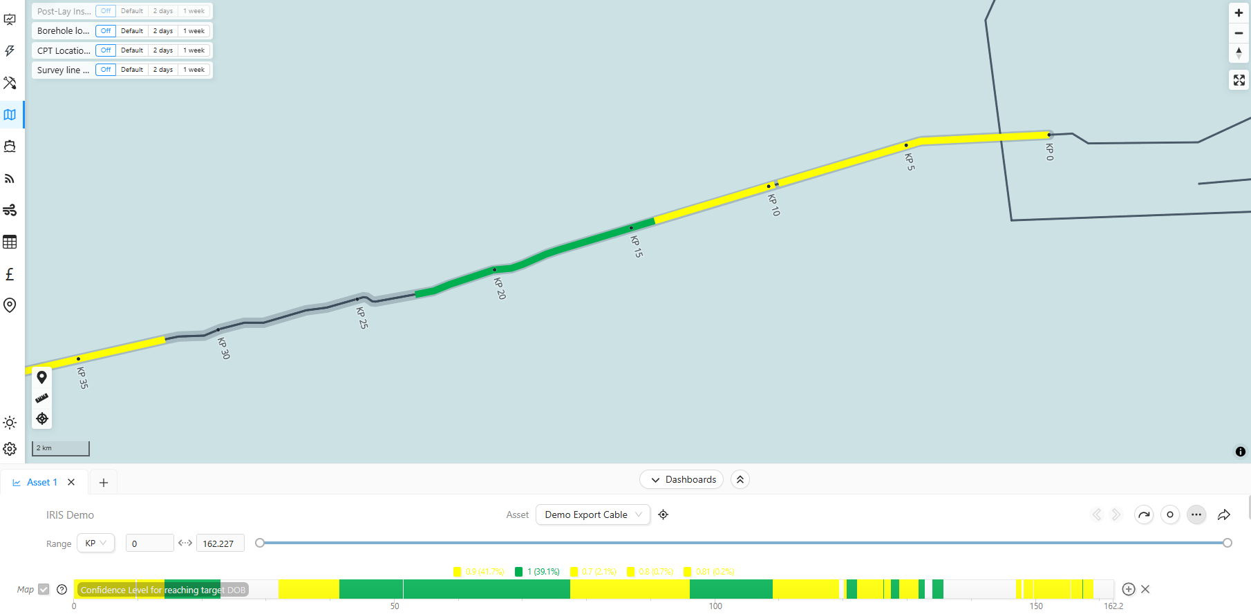
To access the Data Bars select the Add Databars for Asset or the + sign next to an existing databar. A list of the available data will show in the right side panel. the data can be selected through the checkbox to the right, the legend can be viewed by clicking the arrow to the left as well as selecting the data to include.
On the left of the Data Bar there is a checkbox to display it in the map window and a ? icon to show the legend.